text difference in folders between thunar 4.19 and 4.18.7


Hi!
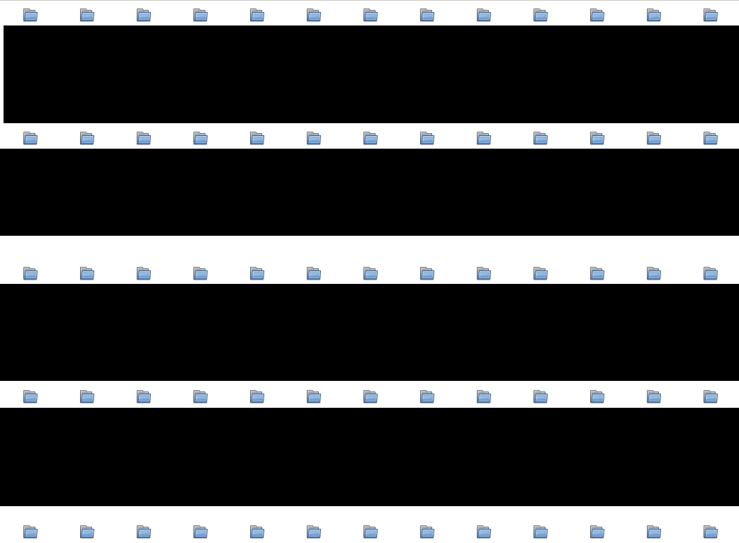
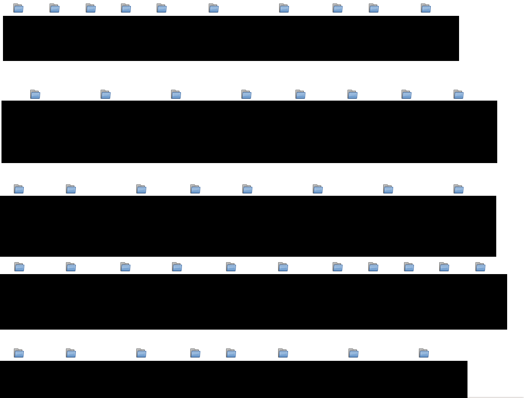
In 4.18.7 folders are showing the name under the folder correctly (see attached image to the left), like it always has in all earlier versions of thunar. Beginning in 4.19.0, se attached image to the right it shows the text much wider, this makes folders with many subfolders with long names very chaotic to say the least. Is this a regression/bug maybe?
Thanks in advance Tomas
Activity

Maybe a consequence of !363 (merged) ?
However, I don't understand why having a wider text makes folders with many subfolders more chaotic. Now you have less horizontal space, so maybe one column less, but more vertical space, so maybe one row more.
Edited by Alexander Schwinnadded 3. Need Info 5. Icon View labels
Yes i also think it has to do with #118 (closed) (!363 (merged)). Problem is that my folders certainly not have same horizontal spacing. Actually i think this new feature makes thunar unusable for me, can it perhaps be made optional?
Real life example with masked folder names:
Notice the same horizontal spacing between folders in Thunar 18.7.
Thunar 18.7
Exakt same folder in 19, this is what i mean with chaotic, different horizontal spacing and not very compact viewing:
Thunar 19

It could be the case that exo@b52fbd4c is also needed to make the spacing work correctly.
The linked change would be part of exo 4.19.0 which has not been released yet.
-
Uh, oh, indeed I forgot about that, good catch @lastonestanding !
@MShrimp4, if you have time (and if you think exo is ready for it), it would be great to have an exo 4.19.0 release. (If you don't have time, I as well could do so during the weekend, if you like)
I was going to release soon anyways (I thought exo@b7106567 alone would be a good reason for a release) so I'll try to do it this weekend!
Edited by Yongha Hwang@alexxcons I released 4.18.1 using xfce-do-release, though it didn't add a new tag by itself so I did it manually. (Is it supposed to be done automatically?)
-
Yea, 4.19.0 is the right one

(Auto-creation of 4.8.x tags probably only works after you created a 'xfce-4.18' branch)
@VonKossa, it would be great if you could re-test, when your distro ships the new release, and best provide new comparison screenshots, in case there is still an issue. (If so, it would b good to have some concrete filenames, in order to be able to reproduce a possible issue with them)
So if i understand you correctly my problem is partly because of above mentioned missing patch in exo. But even if the icons will have same space with patch it will still be a visual departure from how it worked before, because of the text line break. I still think such a change should be made optional and not mandatory.
Edited by VonKossa
Fixed with exo-4.19 bump. Closing issue.
Edited by VonKossaremoved 3. Need Info label
-
@alexxcons Should we bump the minimum required exo version to 4.19.0?
-
Yea, makes sense ... done: c5d8bfa9
mentioned in commit c5d8bfa9